ADVERTISING CONCEPTS FACEBOOK & INSTAGRAM
BIBADO Brief & Objectives
Design ads that will drive traffic to the “Coverall Weaning Bibs” landing page and increase conversions.
Requirements: 2 x sets of ad creatives at 1200 x 1200px
- Top of Funnel (people who are new to the brand/product)
- Bottom of Funnel, people who have already visited the landing page and have shown buying intent
Tactics
The short brief didnt give details about branding, no guide to colour options, tone of voice or image or font assets were provided.
I researched the website as part of the discovery phase to find potential obtain imagery, key words, phrases and selling points as well as fonts.
Once I gathered these together I put together my brand analysis.
BRAND ANALYSIS RESEARCH
My Findings
British brand on a mission to make a positive difference for children
and parents in the feeding and messy play space.
The Bibado weaning bibs offer positive solutions and benefits - some of these
can be used in the ad copy:
- Straps to highchair or pushchair keeping clothes clean and dry
- Easy-wipe material
- Soft and comfortable
- Suits ages 6 months to 3 years
- Stain resistant
- Adjustable straps
- Machine washable and quick to drying
Key observations about the brand based on website review:
- Simple uncluttered look and feel
- Innovative products helping support busy parents
- Big text, solid background colours
- Product and lifestyle shots
- Noticed lack of formal product shots
- Icons are not immediately clear in meanings
Brand Fonts
Headlines and body text
Gilroy
Additional fonts used for Shopify:
Poppins, Questrials, Helvetic, Noto
Potential copy text ideas
Coverall Weaning Bibs
A must-have for weaning babies to 36 months
Let your little one enjoy their mealtime
Adventure in comfort whilst their clothes remain clean, dry and stain-free.
Easy-wipe material
Soft and comfortable
Stain resistant
Machine washable & quick to drying

MY CONCEPT AND APPROACH
Following my review of the minimal brief and analysis of the clients website I wrote out
my thoughts on paper to help focus ideas and direction. Noting down the product
selling points there was plenty to use as body copy however I want the ads kept focused
on one or two features of the product in order to capture viewers limited time and attention span.
As the brief didnt contain any branding guidelines I checked the website fonts and colour palette
and also downloaded the fonts I needed. Collating notes on look and feel for the site I then took
a look at competitors and other baby related products to get a feel for any trends in the market.
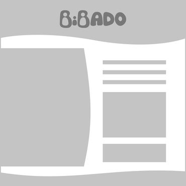
As the time allotted to the project is short I sketched out in Figma some base ideas on possible
layouts and then jumped straight into high fidelity mocks to create 2 x top funnel ads and 2 x bottom funnel designs. I used the website colours as well as the wavy shape in the designs to unify the ads with the website to help with user recognition and trust of the site and products and the ads promoting them.
Part of my concept is to pick one of the products selling points for the top funnel ads, and for the bottom funnel ads where viewers had already visited the site and aware of the product and its features, I chose to focus on offers for the free cutlery and discounts. This will help push them further along the funnel and help motivate to purchase.
I found that I didnt like the icons on the site as I feel they are not easily identified and I created an icon of sorts for the cutlery, and for the wipe clean icon I obtained from Flaticon library.
Lastly I wanted to avoid using baby images that look straight at the camera/viewer, rather I want the baby image to be looking towards the body copy and lead the viewers attention
to that area. For this I chose a left to right layout and flipping the image and made product corrections where needed.
The designs, layout and icon updates are a good starting point for further exploration on the project and more time would enable refining look and feel following client feedback on this initial visuals as well as any campaign strategy from the Performance Marketing team.
.
From sketch idea to silhouette mocks and high fidelity layouts


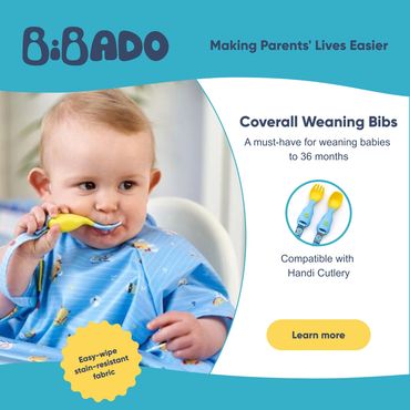
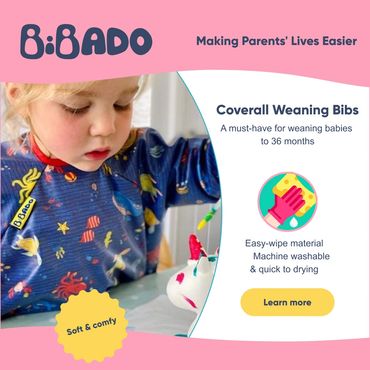
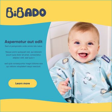


My preference was to use images where faces are not looking into the camera at the viewer as my concept was for the baby image to be looking at the body copy to naturally lead the viewers attention and interest to that area and the messaging.